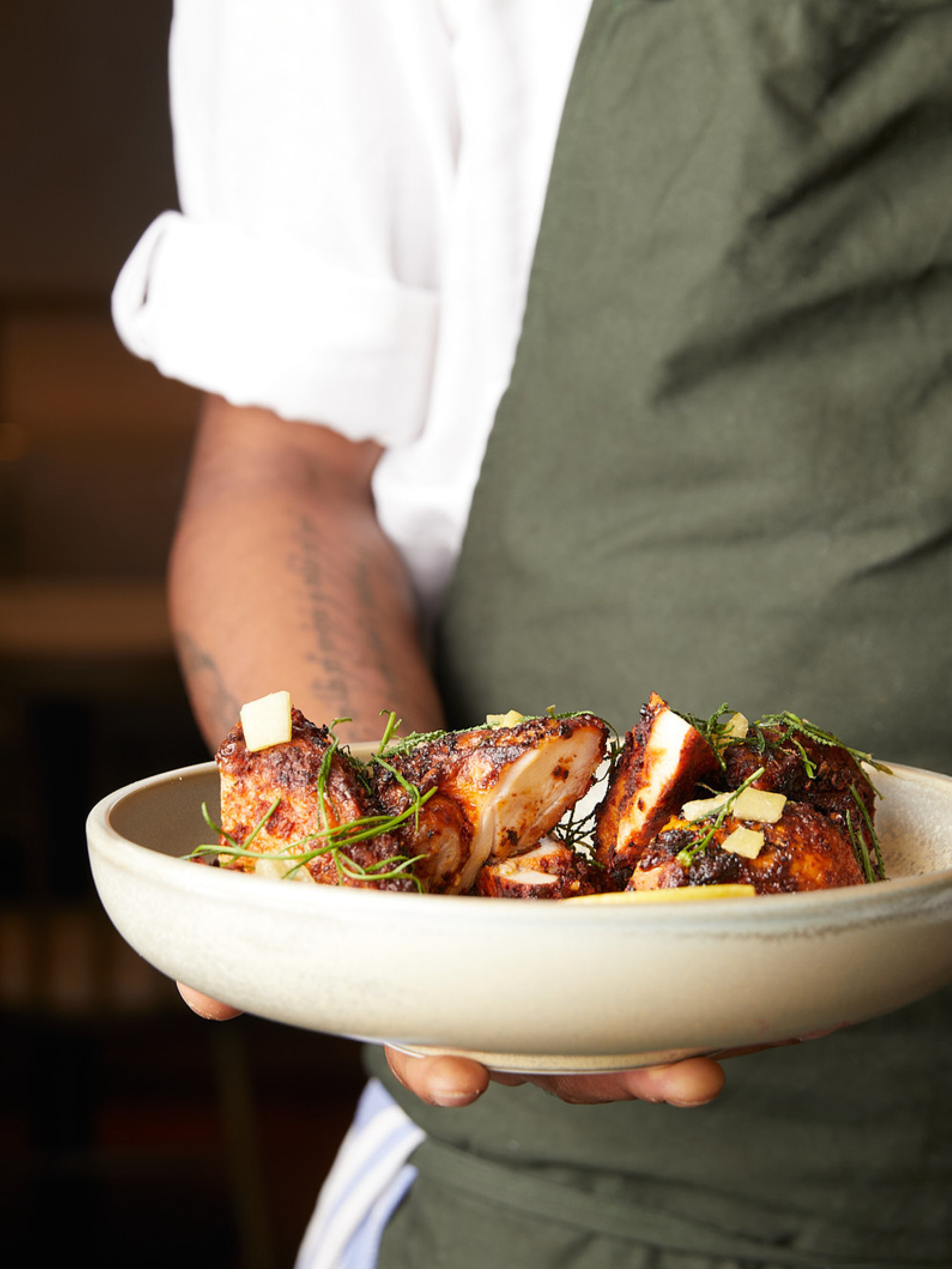

With a focus on Middle Eastern inspired flavours, Elma is all about sophisticated simplicity – using seasonal produce, treated with respect.
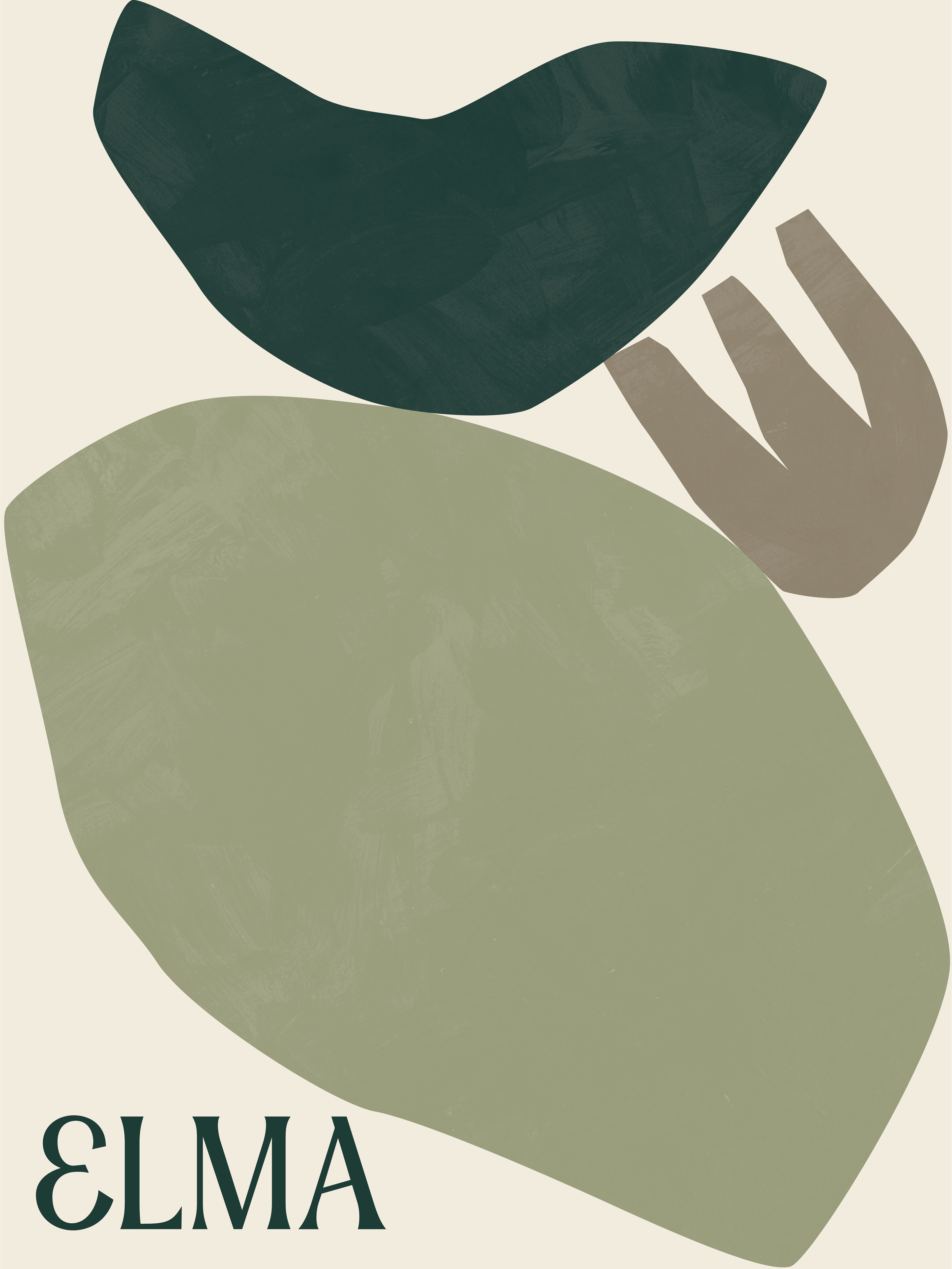
The bespoke logotype for Elma is inspired by Middle Eastern typography.
The branding utilises organic shapes as an abstract take on the produce and ingredients,
also symbolising coming together. A natural colour palette and the use of textured papers and embossed details, selected to complement the interior's marble, brass and leather materials palette, helps to communicate the care and craft that is taken with the food
and the service at Elma.
Brand Identity
Menu Design
Illustration
Signage
Digital Design
Menu Design
Illustration
Signage
Digital Design
Awarded Commendation - Eat Drink Design Awards 2021
Created while at One&Other
